Assassin's Creed Shadows' Yellow Paint: A Developer's Late-Stage Solution for Player Navigation
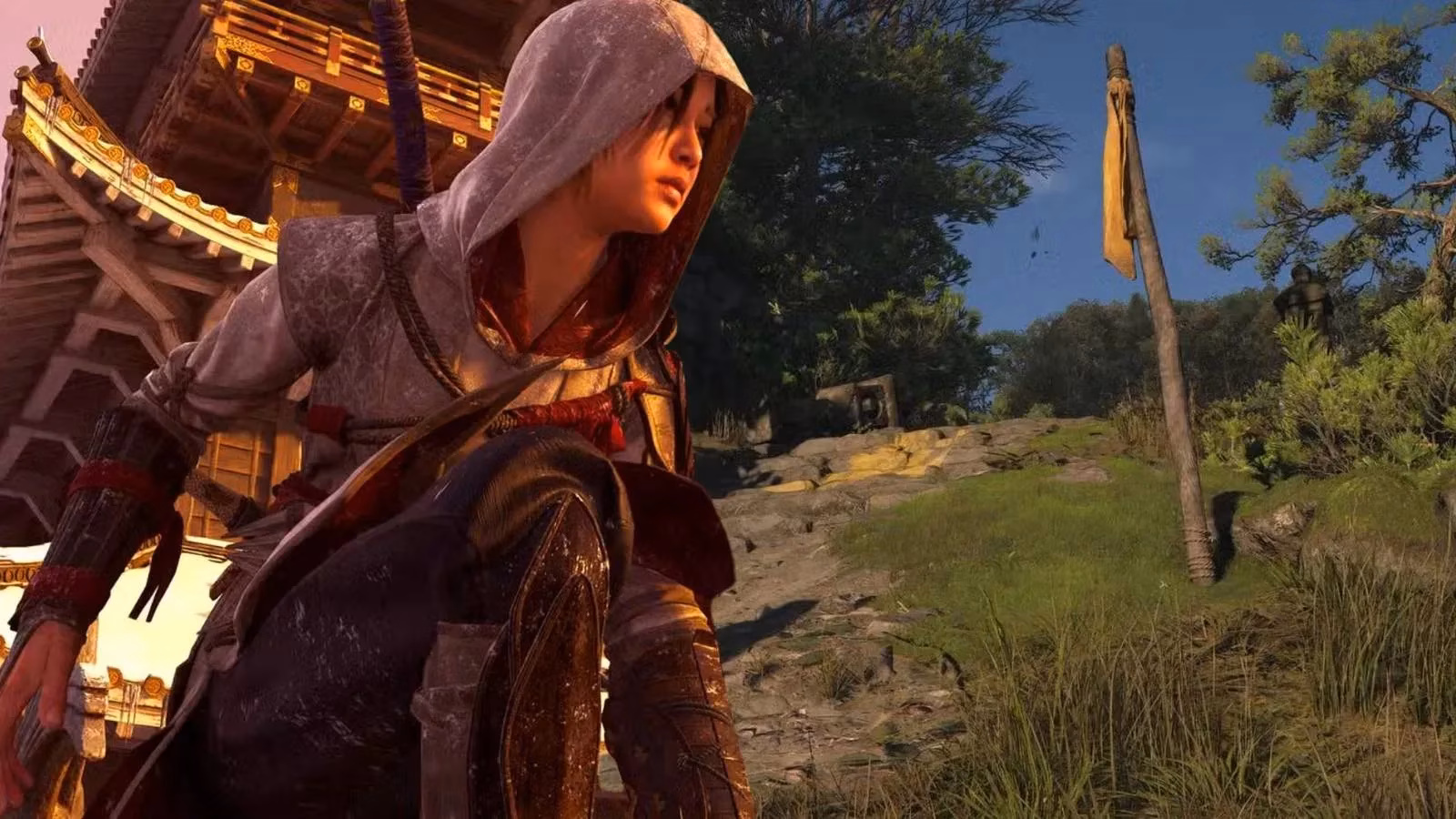
As a dedicated gamer, I've been following the ongoing, often heated, discussions surrounding the use of 'yellow paint' in video games. It's a topic that flares up with almost every major release, and in 2026, Assassin's Creed Shadows found itself squarely in the center of this debate. When I first booted up the game, I have to admit, I barely noticed the yellow markings during my initial hour and a half of exploring feudal Japan. They felt integrated, subtle. Yet, the online discourse was buzzing, questioning the necessity of this visual aid. Little did we know, this external conversation mirrored an internal one that had already taken place within the development team at Ubisoft.
It turns out, according to a revealing interview with creative director Jonathan Dumont, yellow paint was not originally part of Assassin's Creed Shadows' design. This fact alone is fascinating. It suggests the developers were either aware of the potential for controversy or, perhaps more likely, initially believed they could guide players through the game's intricate environments using more organic methods. The decision to add it was not an artistic one made in a vacuum, but a practical solution born from player feedback during crucial playtesting phases. Dumont explained that without these visual cues, testers "really struggled to find their path" during specific activities like the Hidden Trails. This struggle presented a clear problem: player frustration trumped aesthetic purity.
The common critique I see online, echoed in comments on interviews like Dumont's, is that yellow paint is a lazy shortcut. Critics argue it breaks immersion, slapping an unnatural, bright color onto a world meant to feel authentic. They propose that developers should weave guidance into the environment itself—through lighting, texture, or architectural design. While I understand and often appreciate that ideal, my experience as a player makes me sympathetic to the developers' choice. In a vast, dense open-world game like Assassin's Creed Shadows, where players are asked to invest dozens of hours, clear navigation isn't a luxury; it's a necessity to prevent burnout and frustration. The choice of yellow isn't some unthinking trend-following; it's a color that provides maximum contrast against the game's natural palette of greens, browns, and grays, making it instantly visible without being garish.
Reflecting on other games, I appreciated a similar approach in Final Fantasy VII Rebirth. Both titles ask a lot from the player, and subtle guidance helps maintain momentum. However, I must emphasize that Assassin's Creed Shadows implements this tool with notable restraint. From my playthrough, it's clear the team tried to disguise it:
-
It's used sparingly: Vast stretches of climbable rock faces and trees lack any yellow markings, encouraging environmental observation.
-
Placement is contextual: The paint often appears on man-made objects like wooden beams or stone edges, feeling slightly more diegetic than paint on sheer cliff faces.
-
It's a last resort: According to the developers, it was added after the core design failed to guide players effectively. This isn't a crutch used from the start, but a corrective measure.
The gaming community can sometimes adopt a dogmatic stance on features like this, condemning any use of yellow paint as a failure of design. Assassin's Creed Shadows serves as a perfect case study for why this conversation needs more nuance. Here, the yellow paint wasn't a default setting; it was a specific, data-driven solution to a verified problem. The alternative—leaving players lost and annoyed—would have been a far greater criticism of the game's design. The implementation shows a team listening to feedback and making a tough call between artistic vision and player accessibility.
Ultimately, my time in Assassin's Creed Shadows convinced me that this debate might be missing the forest for the trees. The presence of yellow paint didn't diminish my immersion in the story of Naoe and Yasuke. If anything, by reducing moments of confusion, it allowed me to engage more deeply with the world and its mechanics. It's a reminder that game development is a complex balancing act. While we should always push for elegant, immersive design, we must also acknowledge the practical realities of guiding a diverse player base through increasingly complex virtual worlds. Assassin's Creed Shadows doesn't use yellow paint because it's lazy; it uses it because, in specific instances, it was the most effective tool for the job, applied with a careful hand that respected both the player's time and the game's atmosphere. Perhaps it's time we judged these features not by their mere presence, but by the thoughtfulness and restraint of their application.